




PROJECT DESCRIPTION
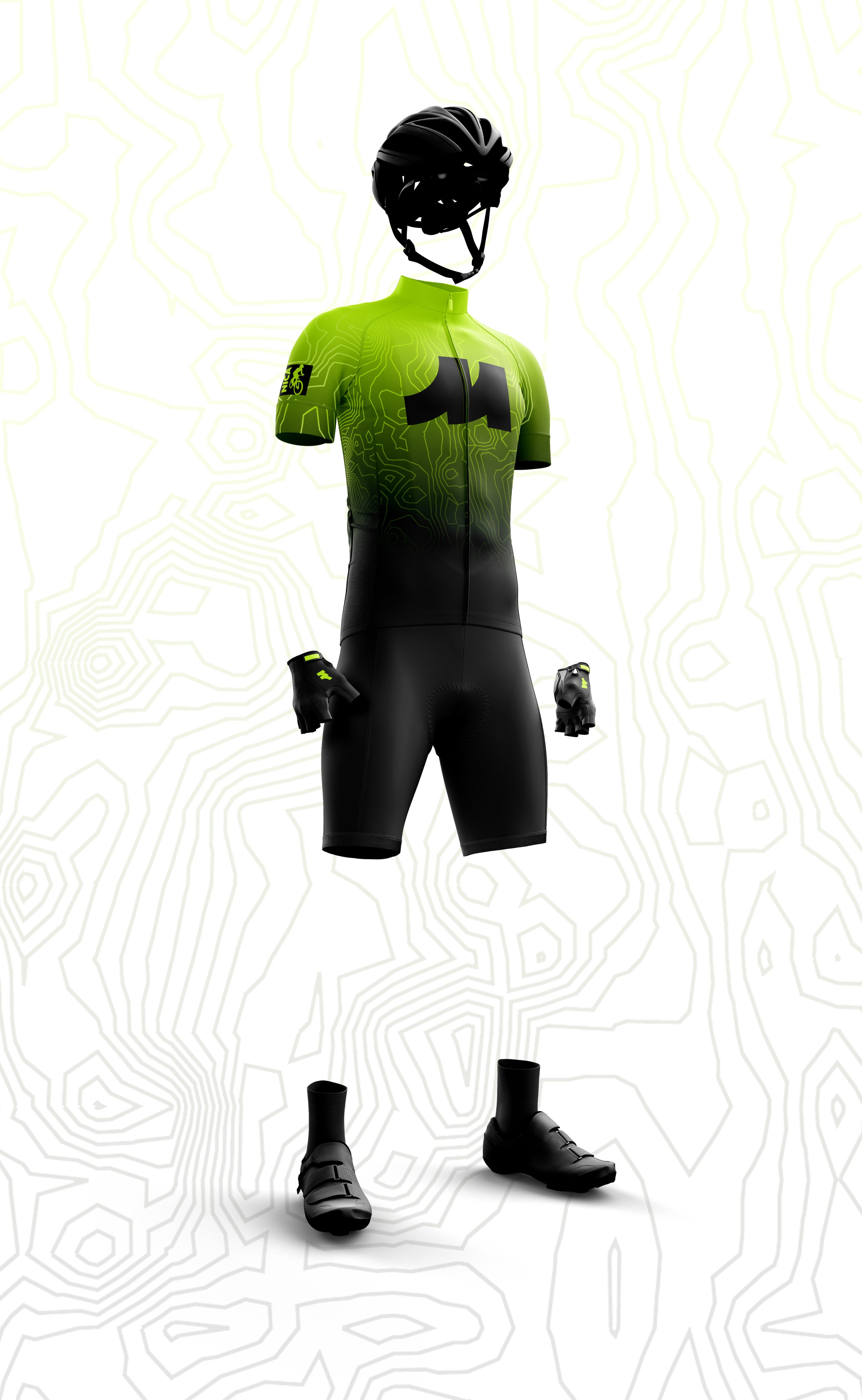
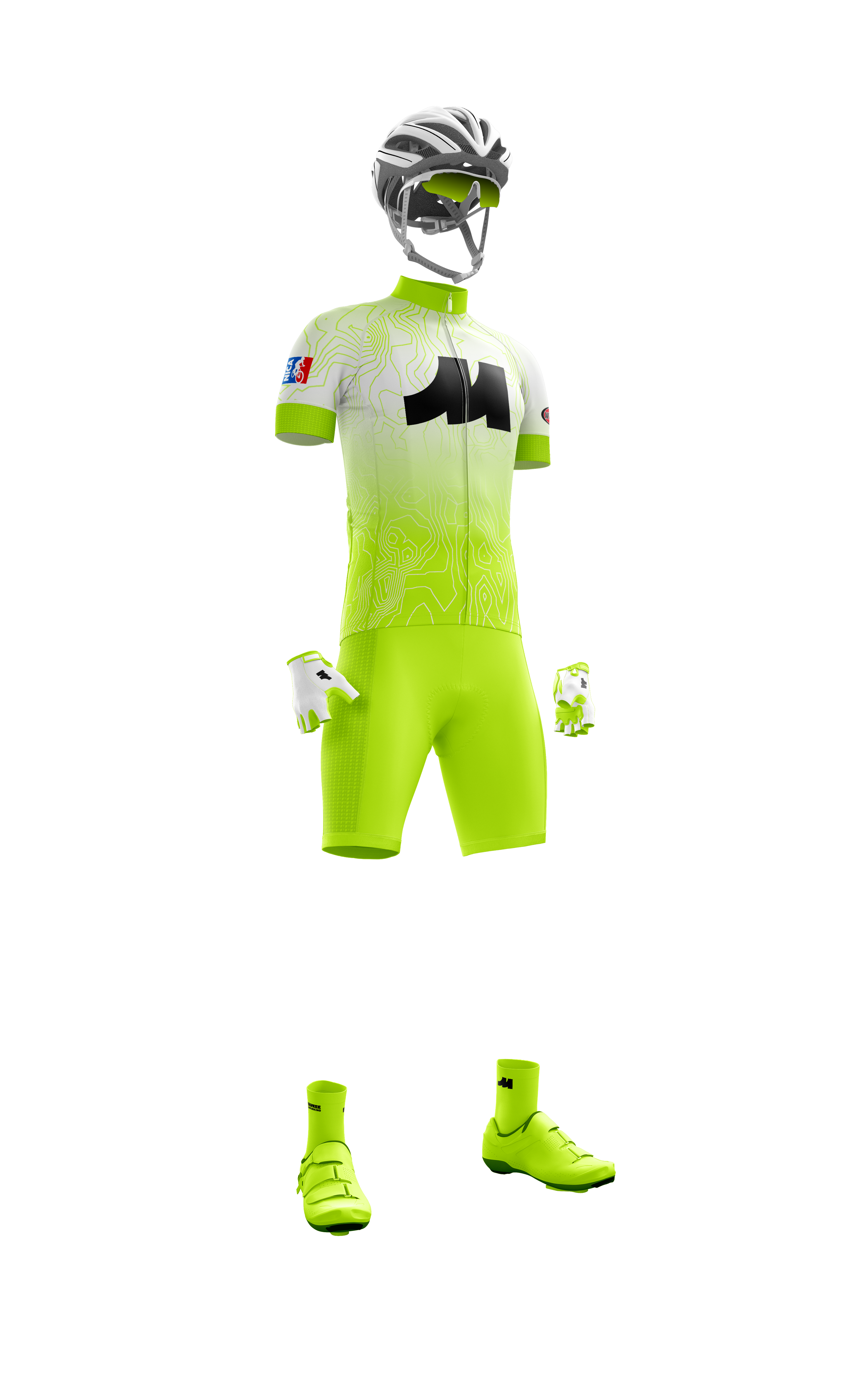
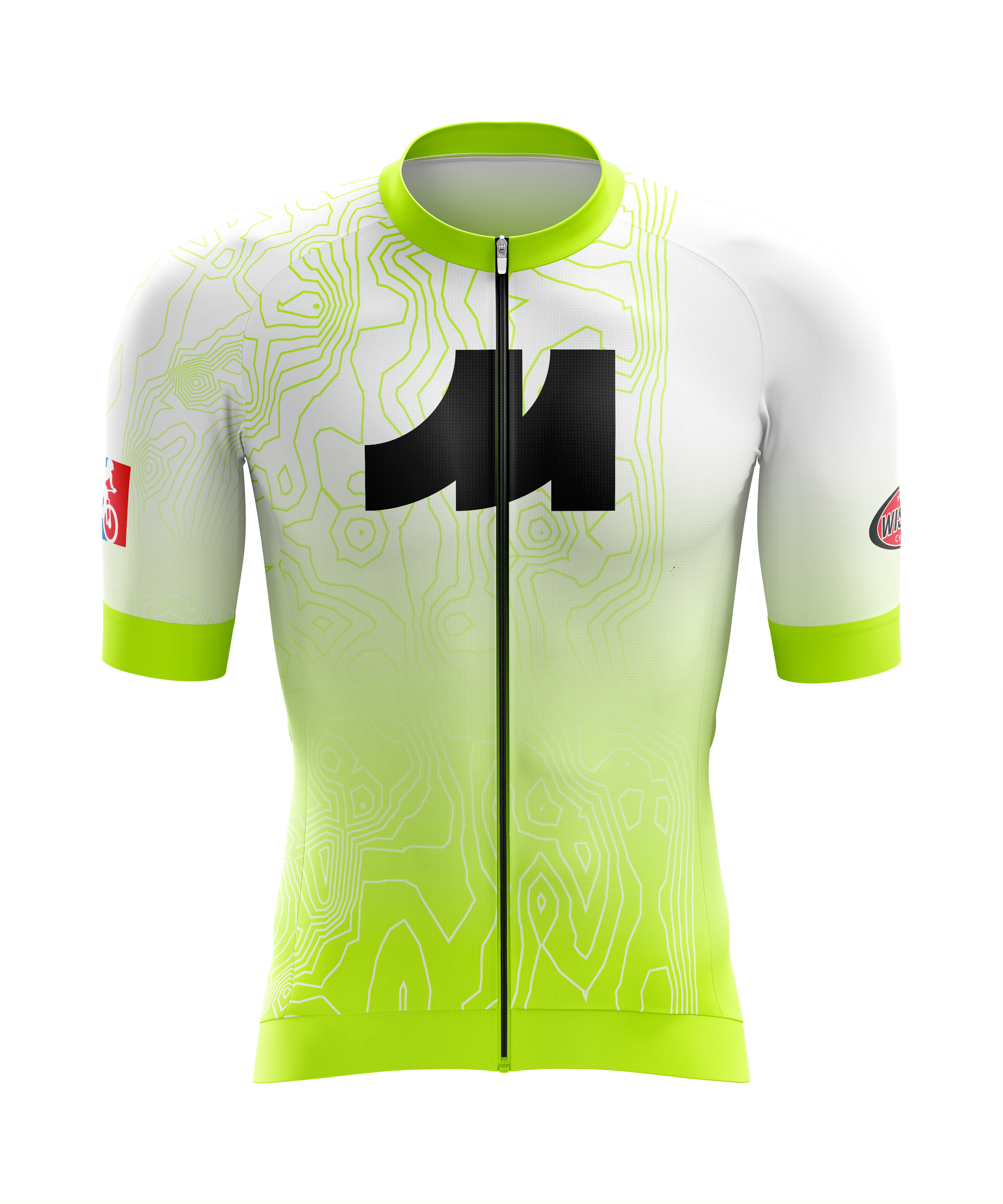
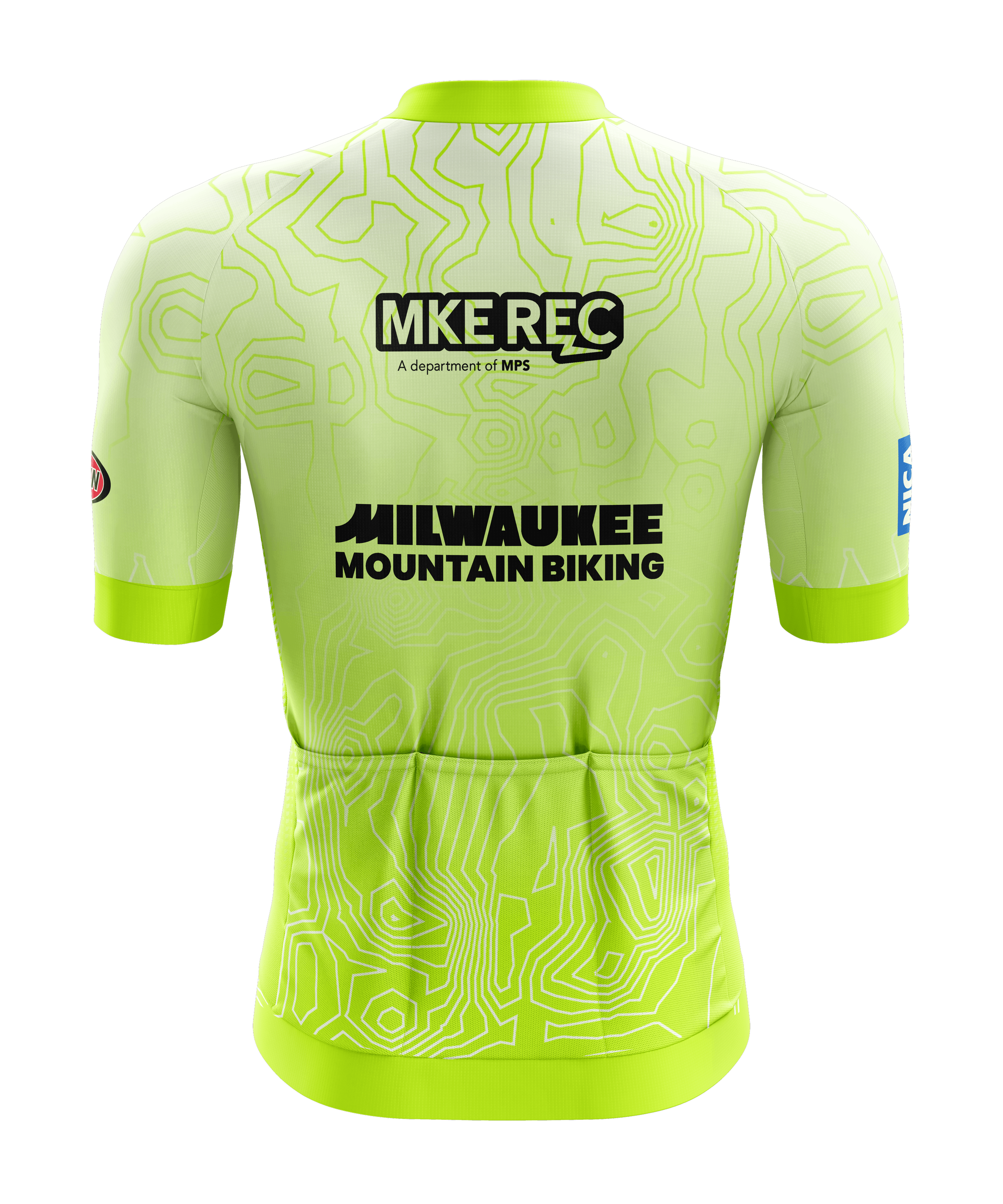
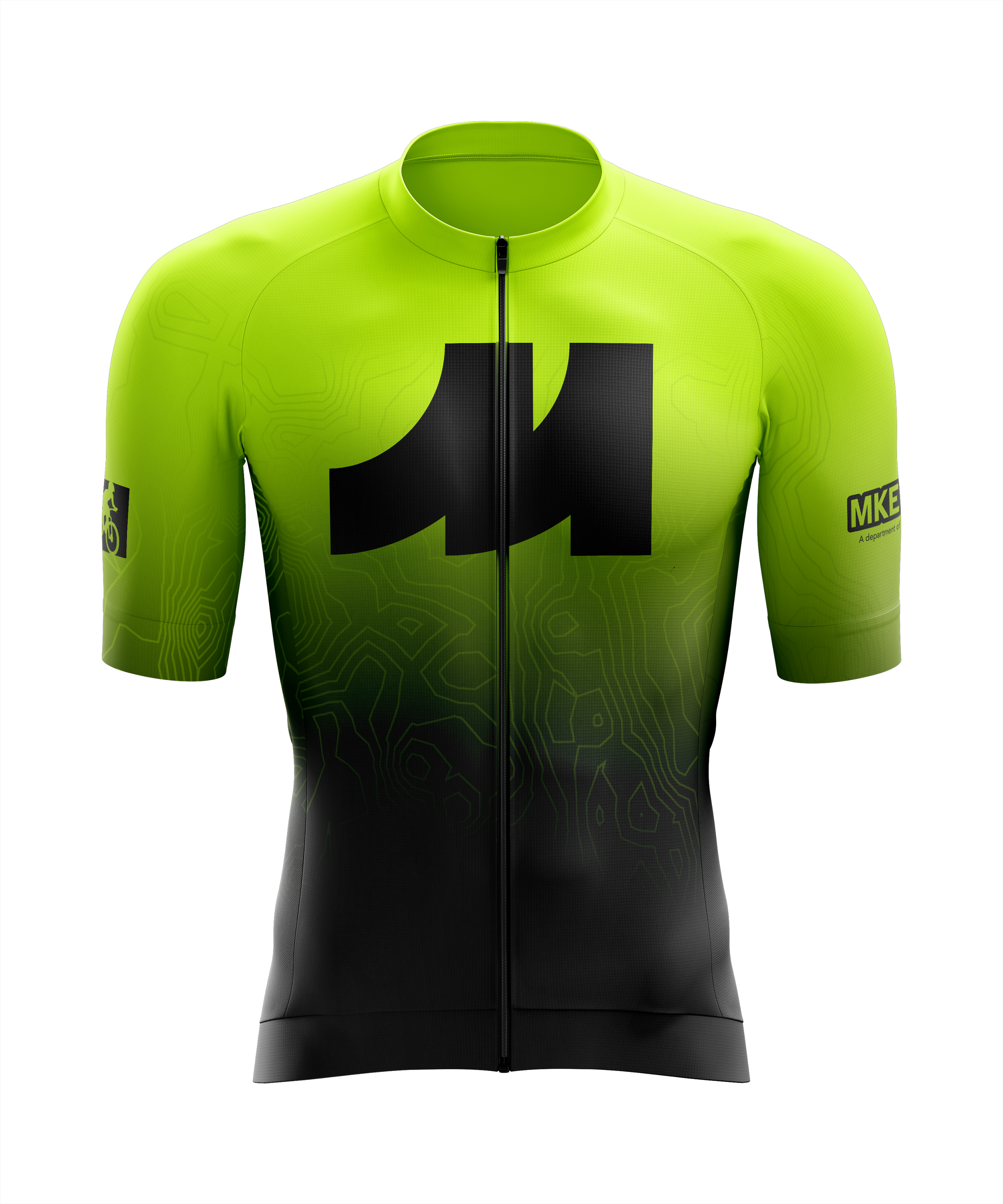
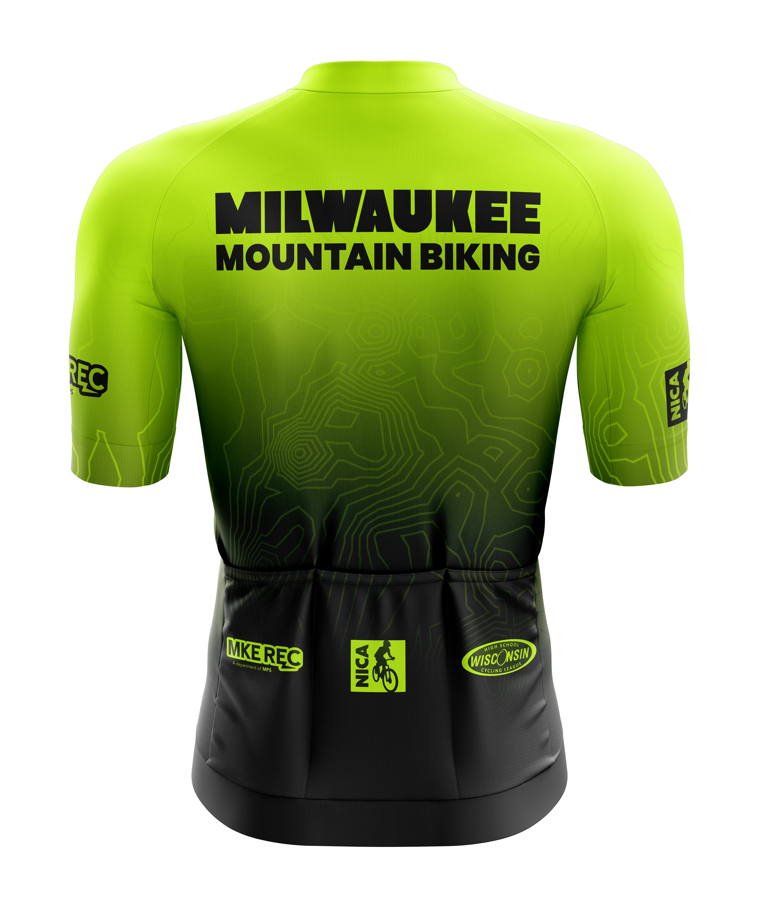
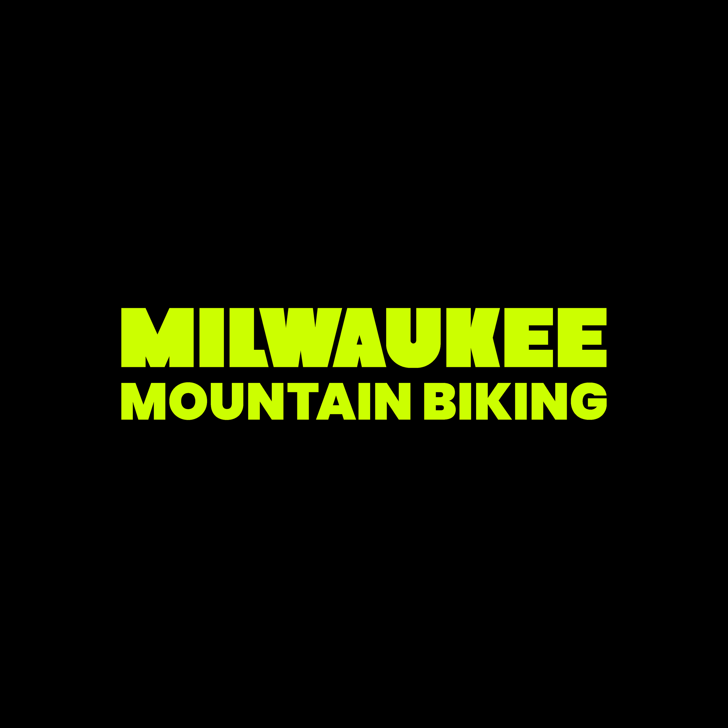
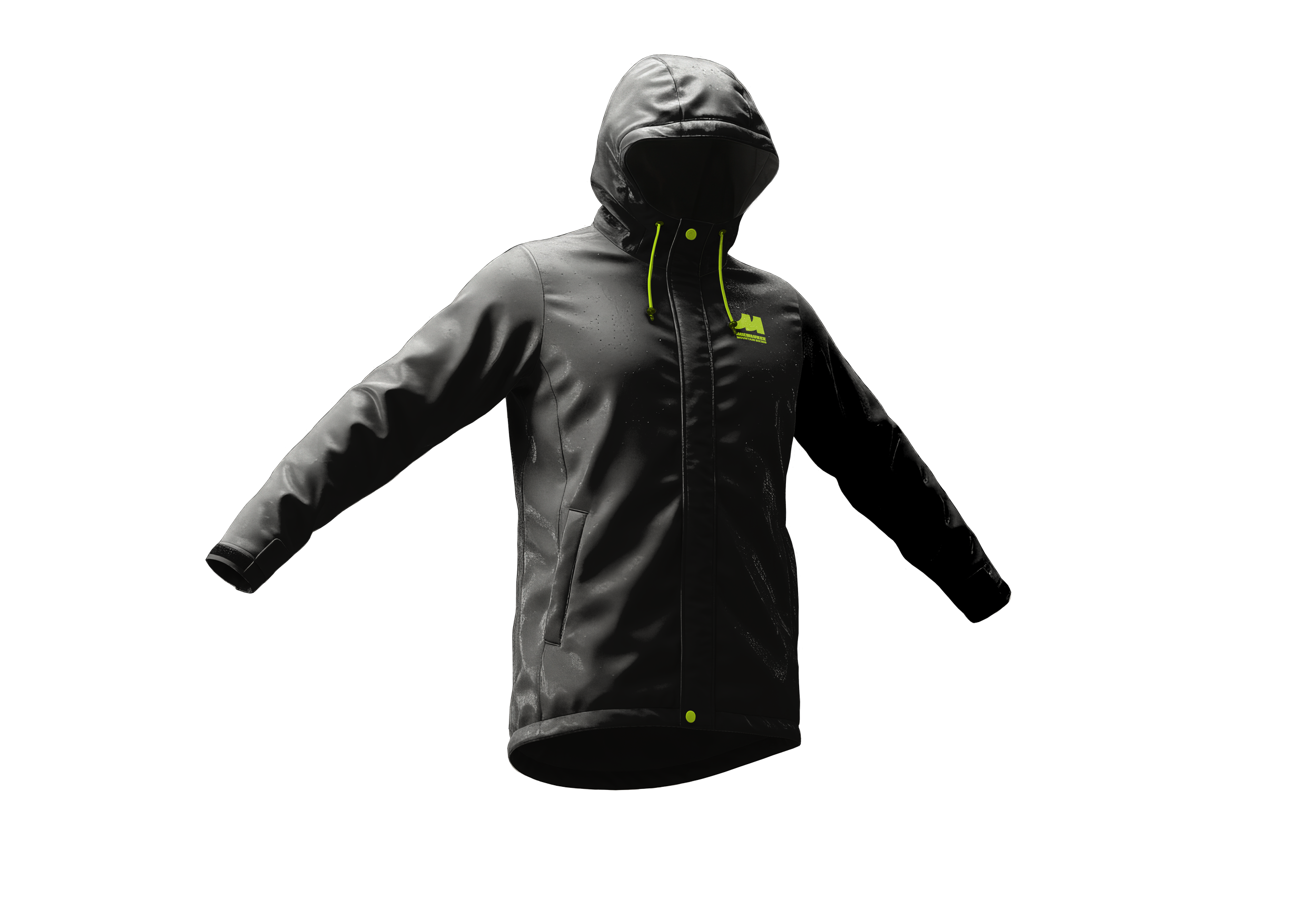
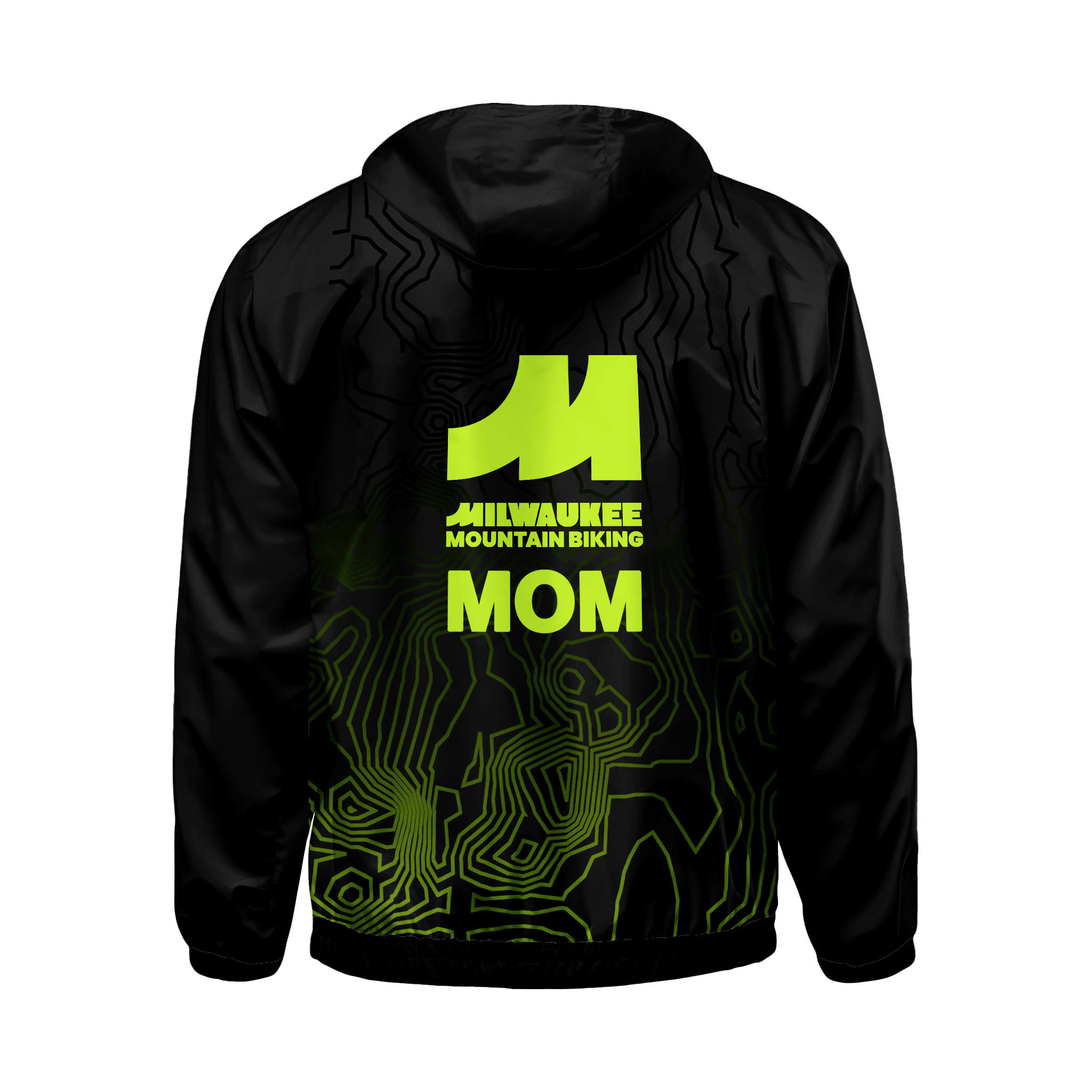
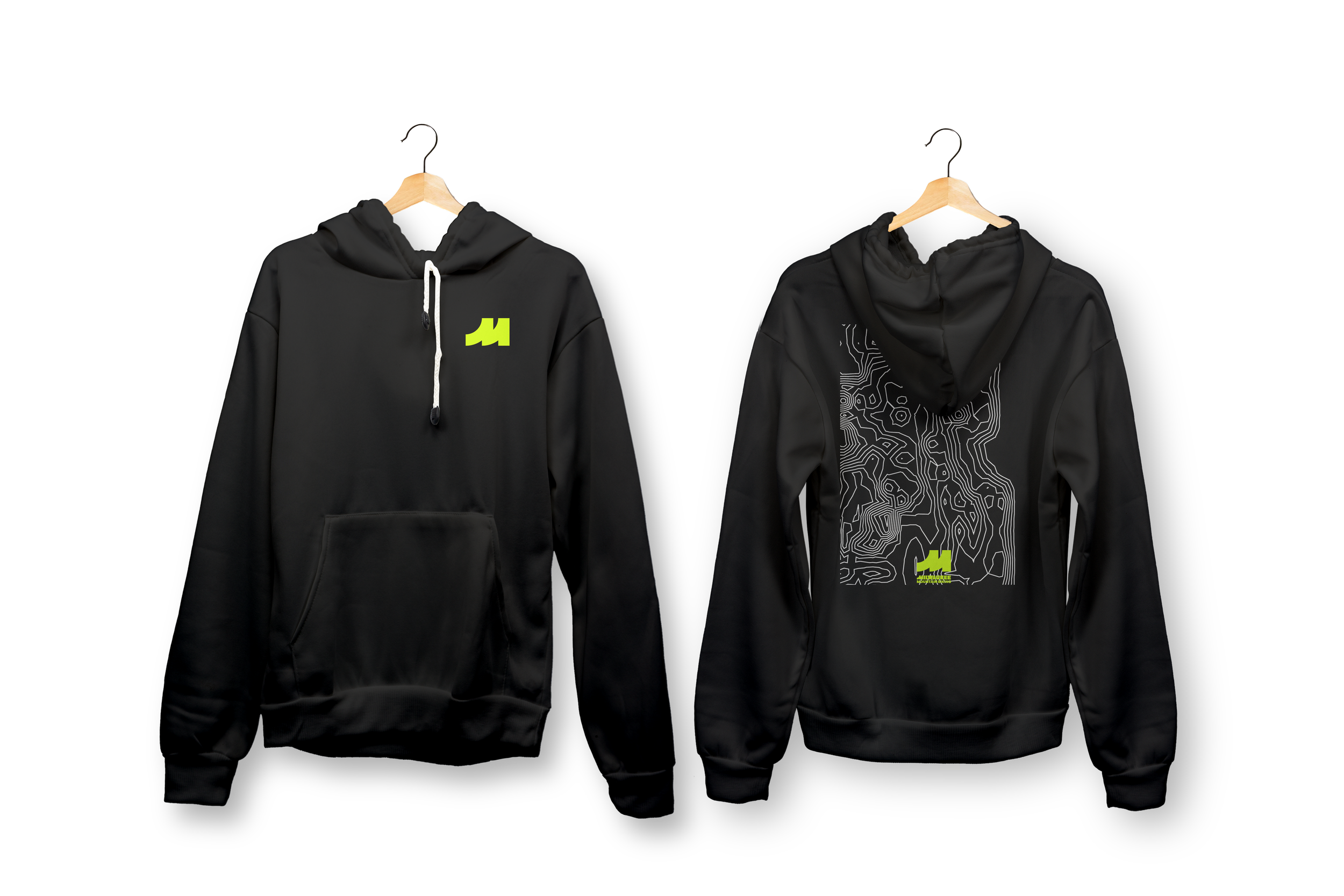
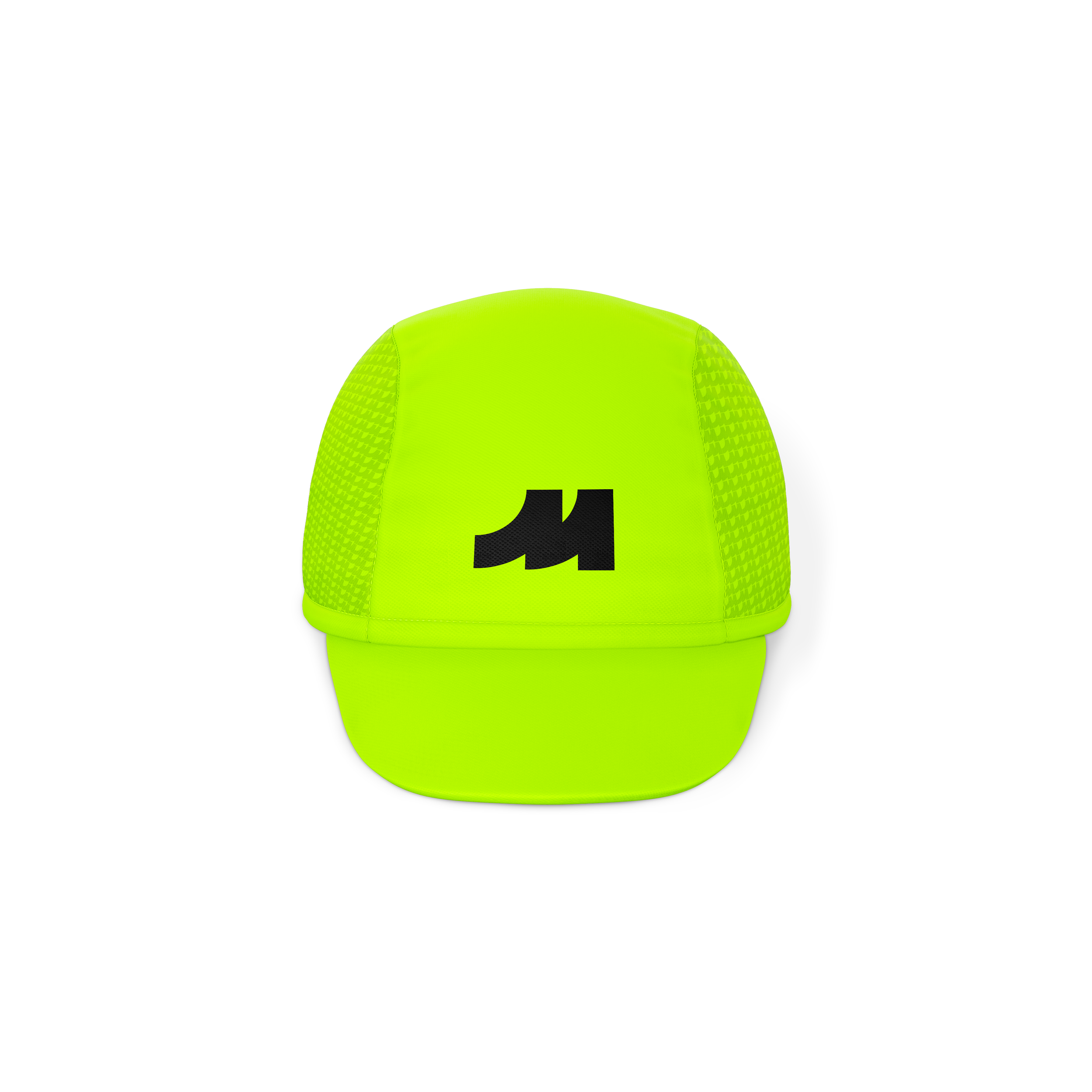
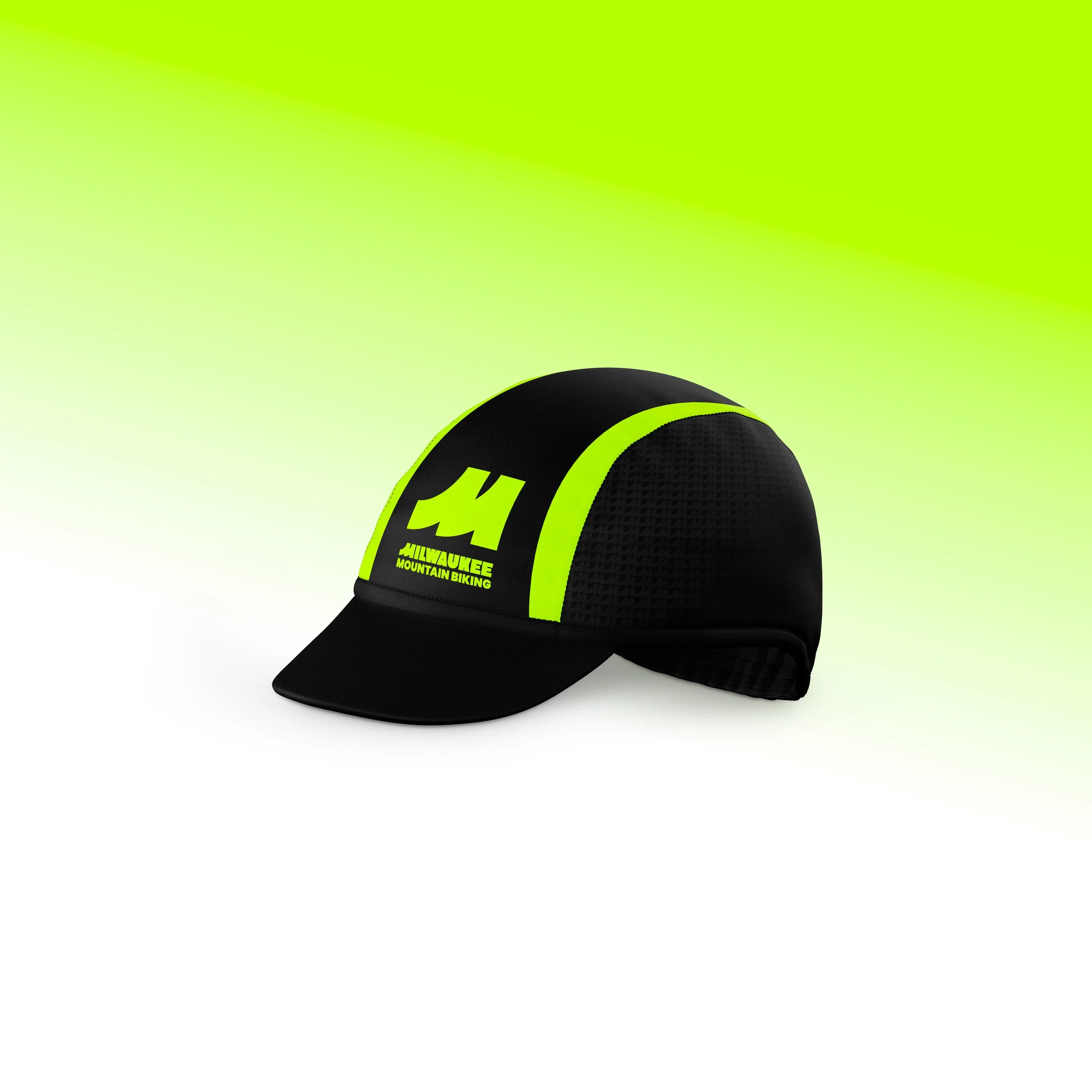
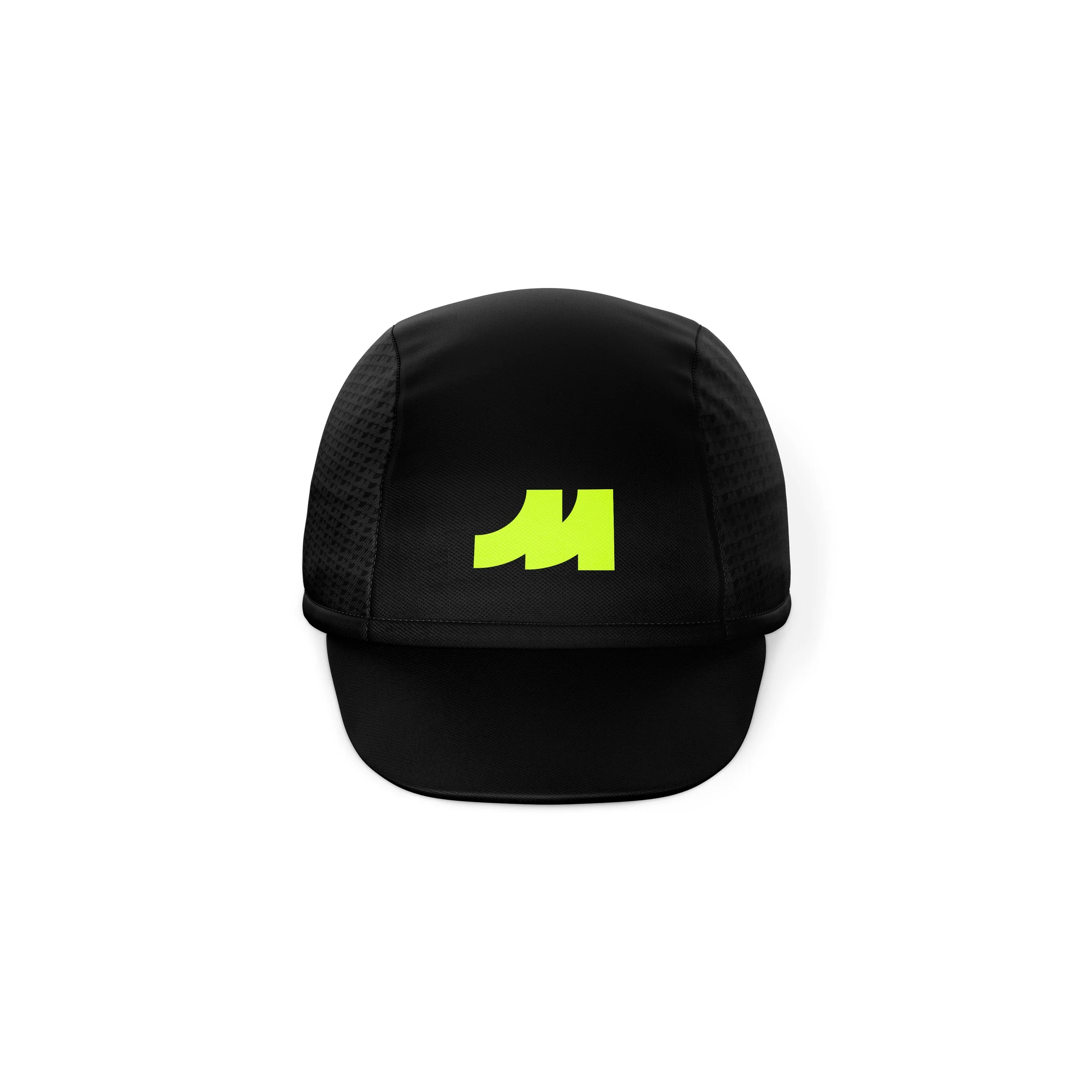
Entrusted by the Milwaukee Recreation Mountain Biking Team, this brand identity reflects the grit, perseverance, and pride built through every ride. From after-school practices at the trailhead to the celebration waiting at the finish line, the system was designed to unite athletes, families, and the community through a bold and timeless visual identity that carries across every touchpoint.
Centered on the athlete and the journey of who they strive to become, the identity ties the art of growth to the city itself and its relentless pursuit of becoming better than it was before.
Much like Milwaukee, this marks a revival for the team: a renewed brand and voice driven by the same determination to improve with every season. Inspired by Milwaukee’s iconic Cream City Brick, the identity reflects resilience and transformation, mirroring both the team and each athlete’s continuous pursuit of becoming stronger every day, rising after every setback, and pushing forward toward the finish line.
CREDIT
Thank you to Adam Setala and Brian Bowles for the art direction and guidance!
A sincere thank you to the team at Milwaukee Recreation MTB for selecting my brand designs.
MEDIA/ MEDIUMS
Adobe Illustration, Photoshop
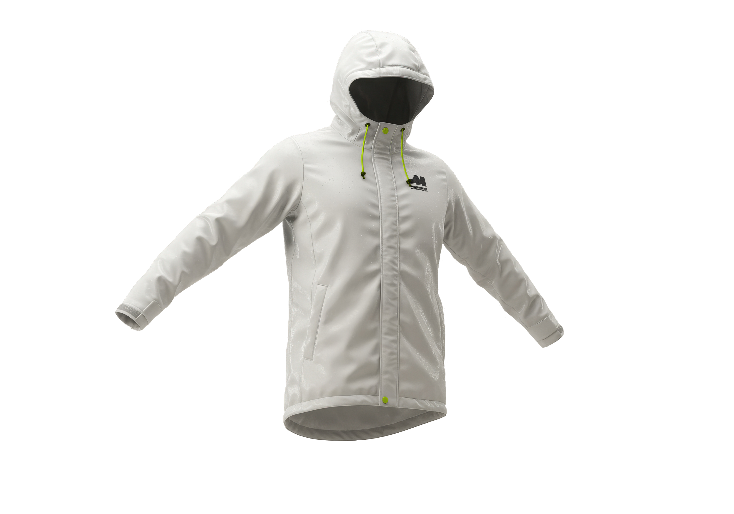
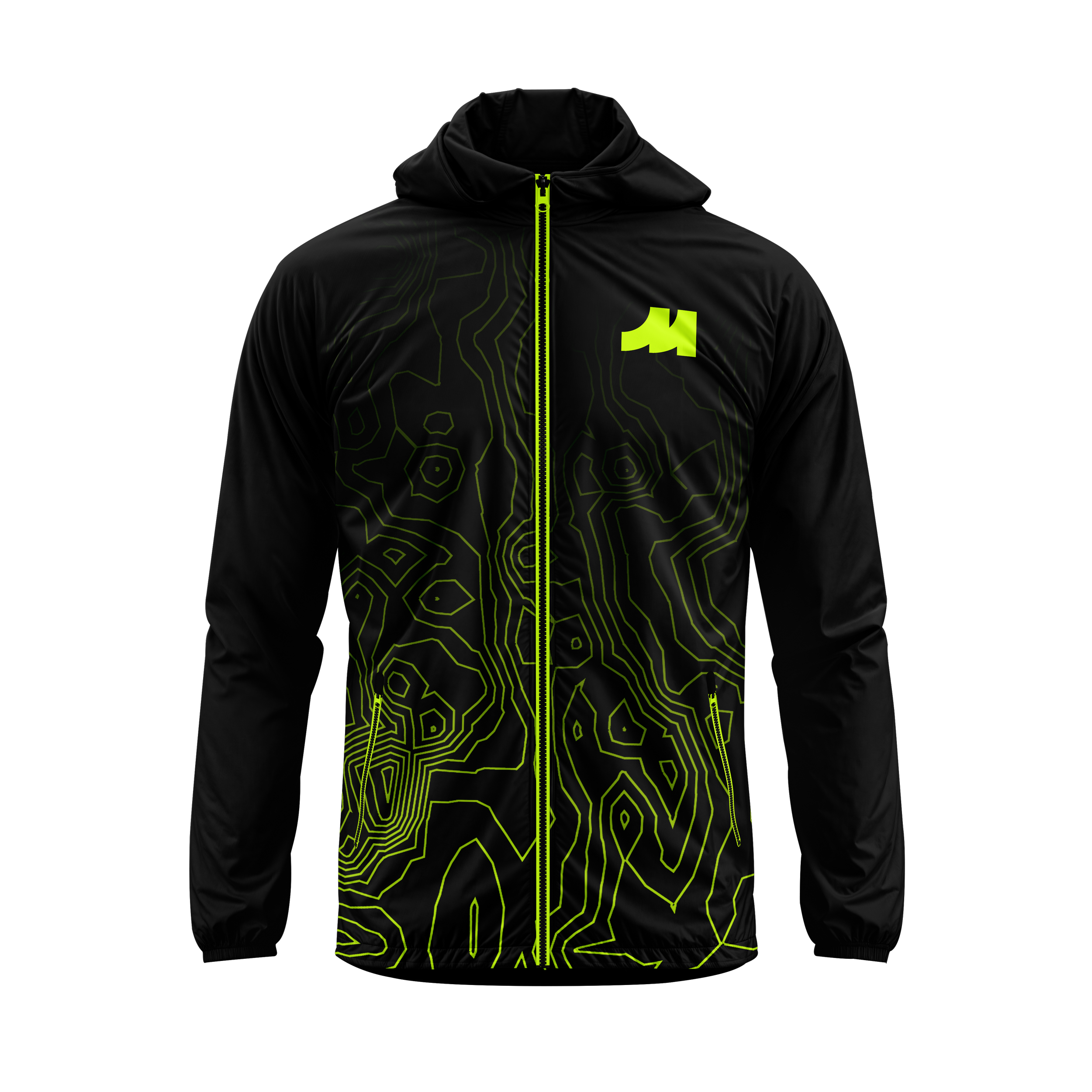
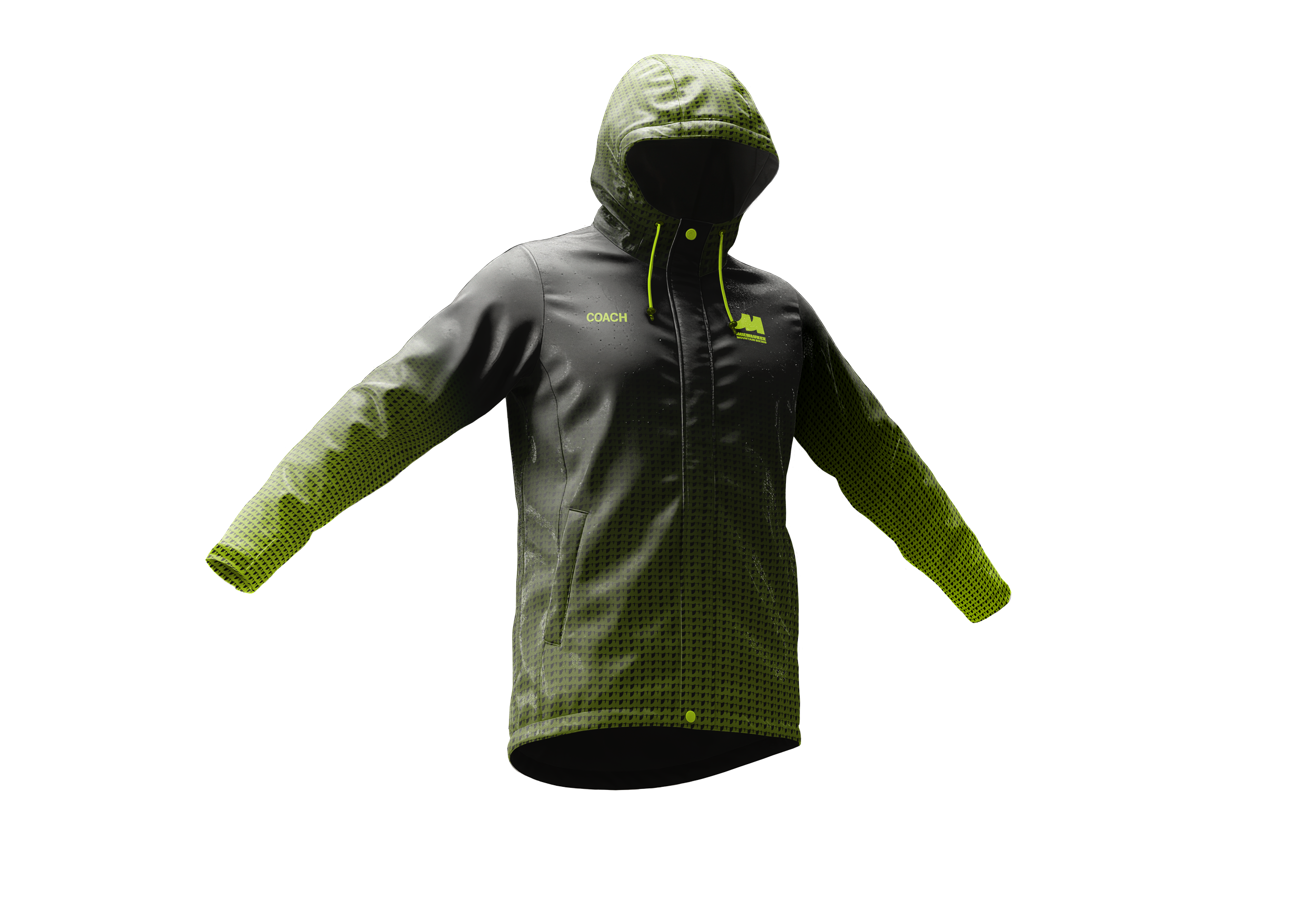
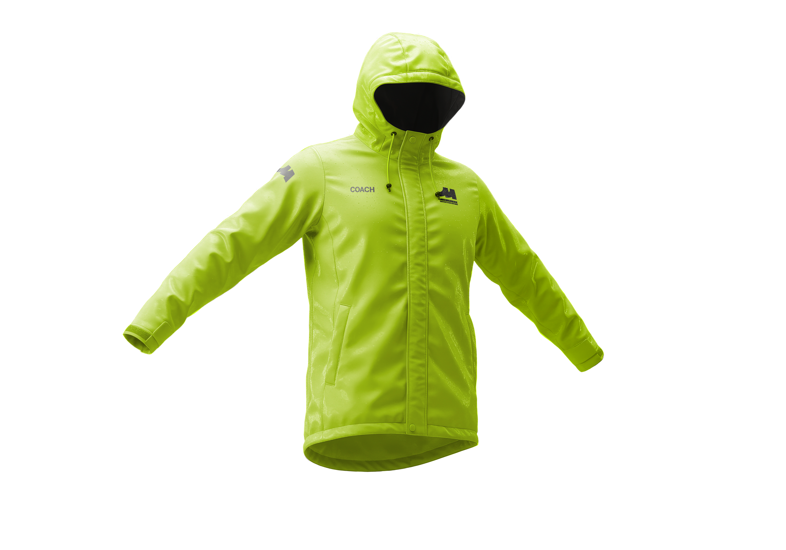
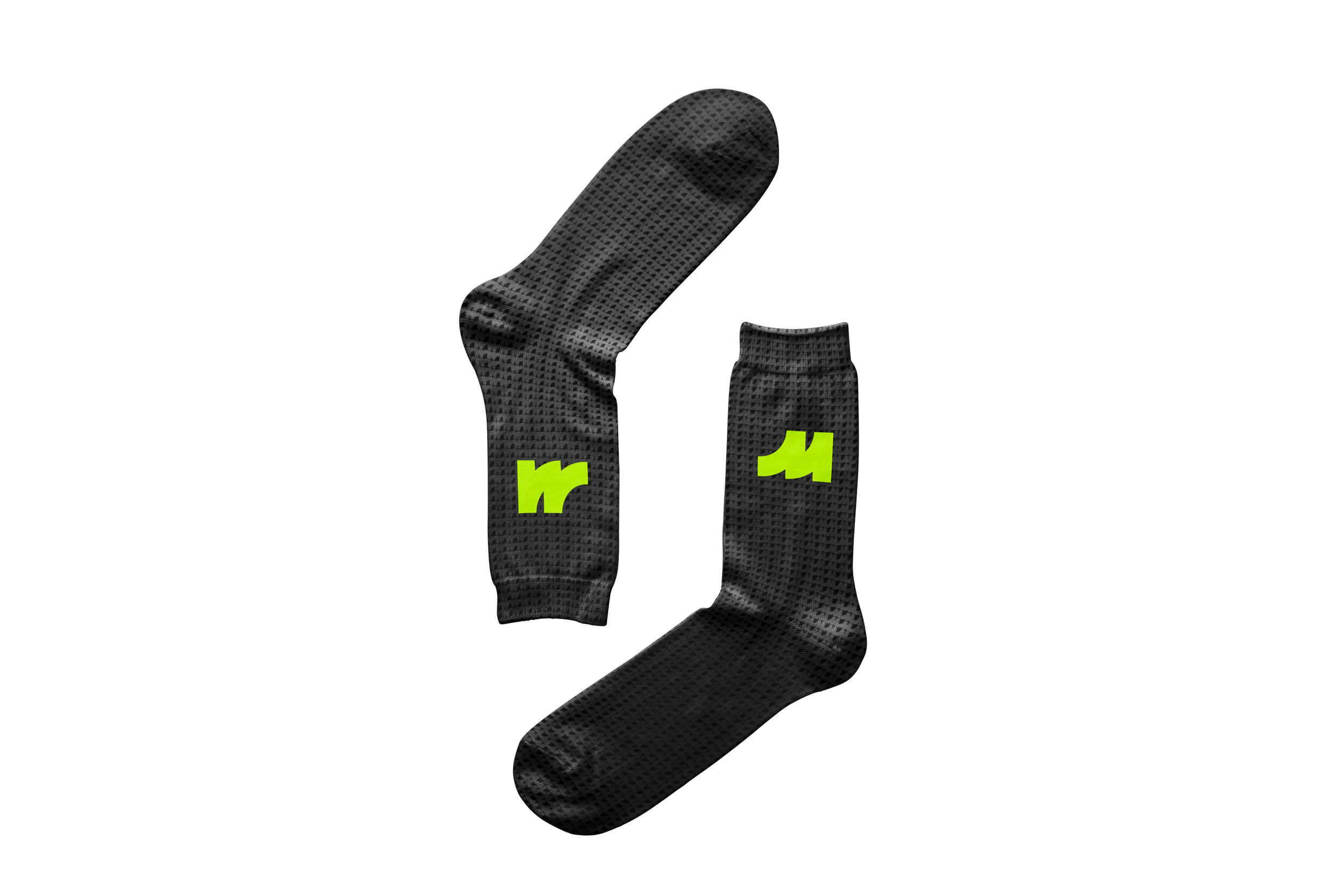
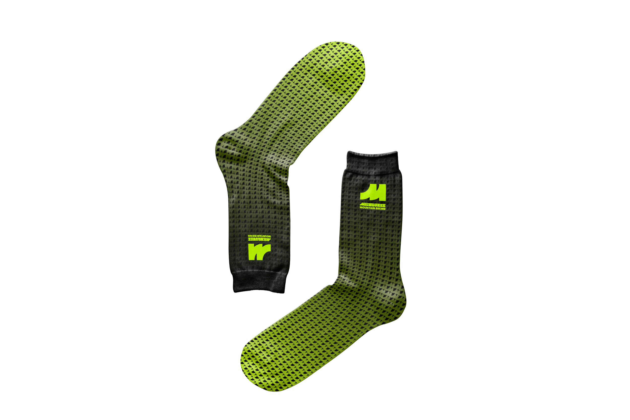
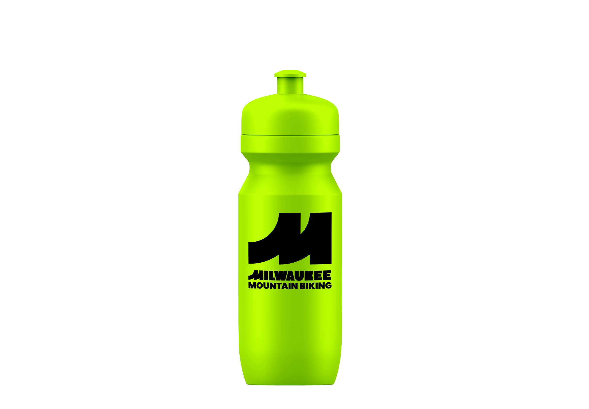
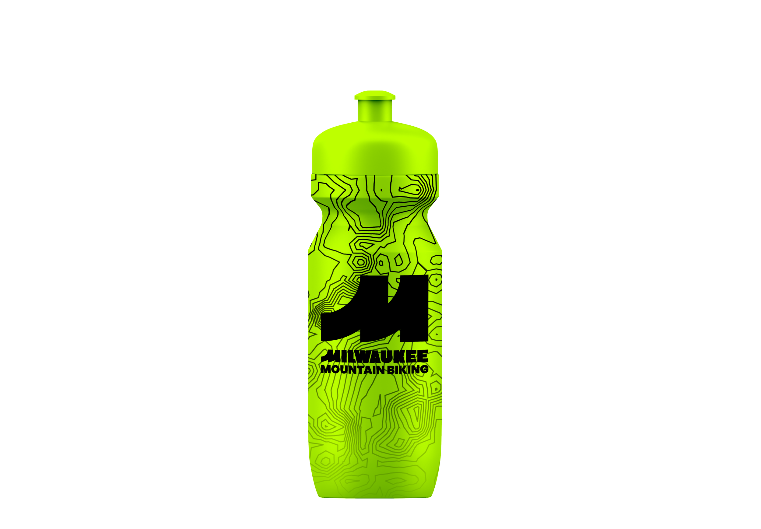
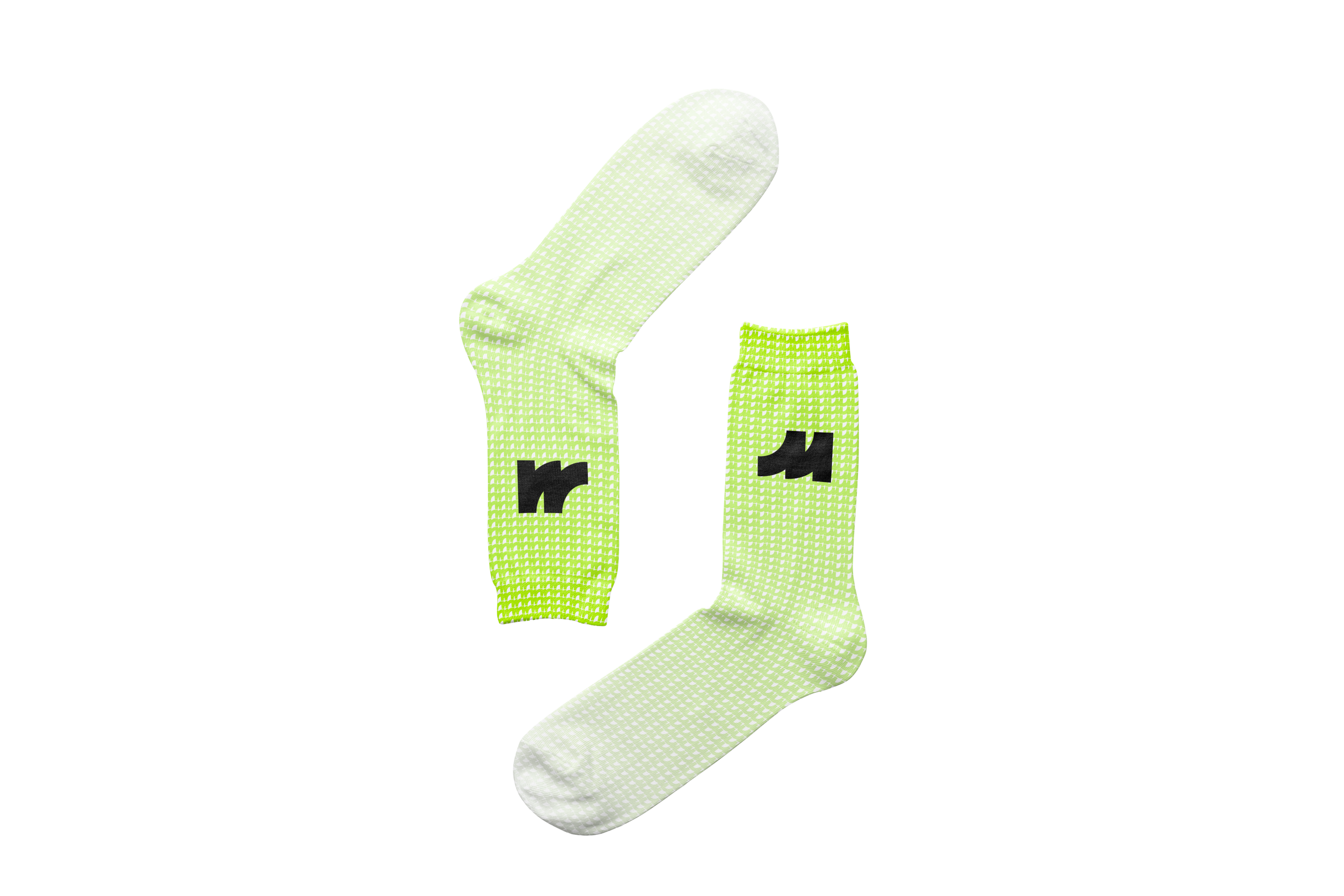
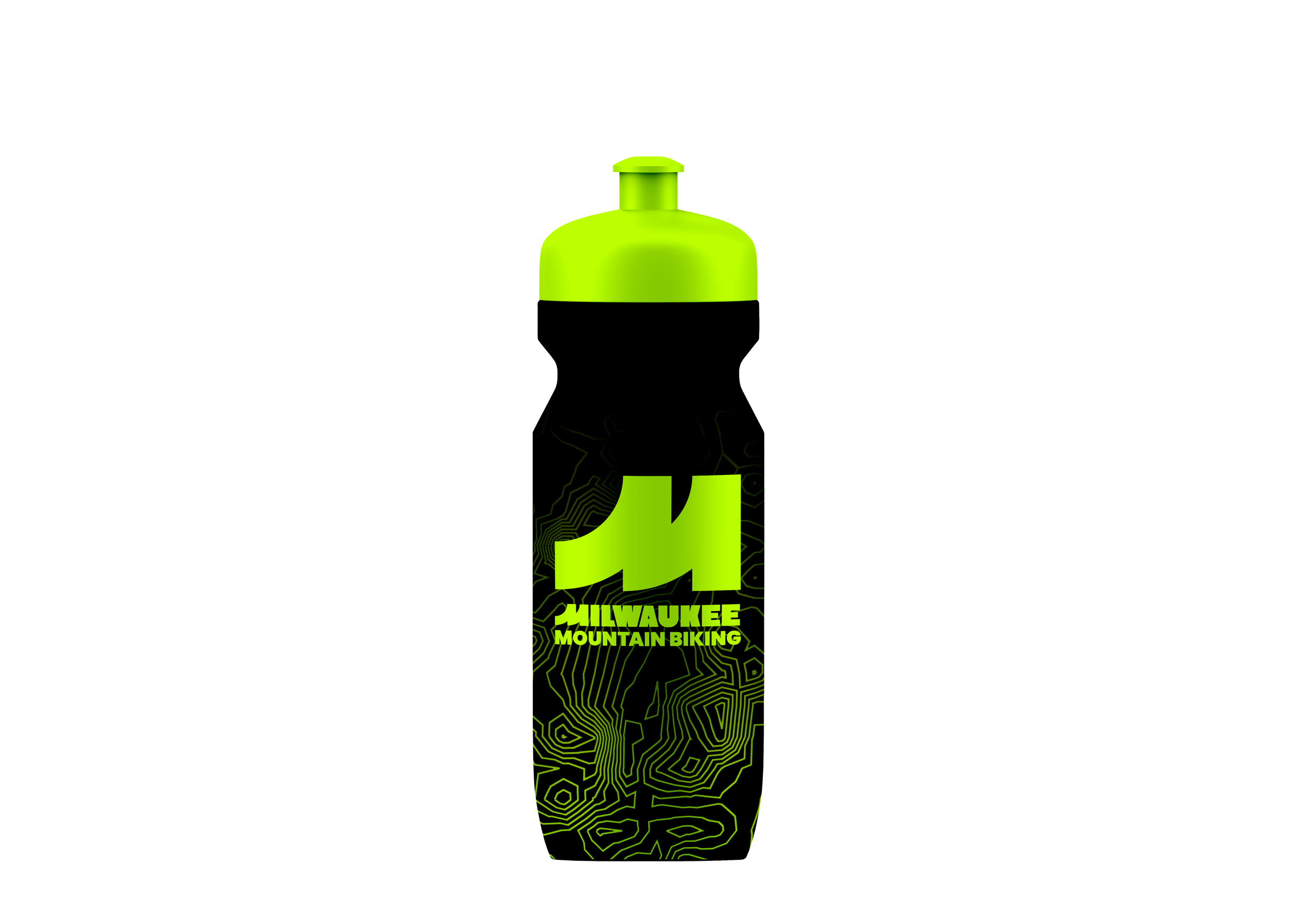
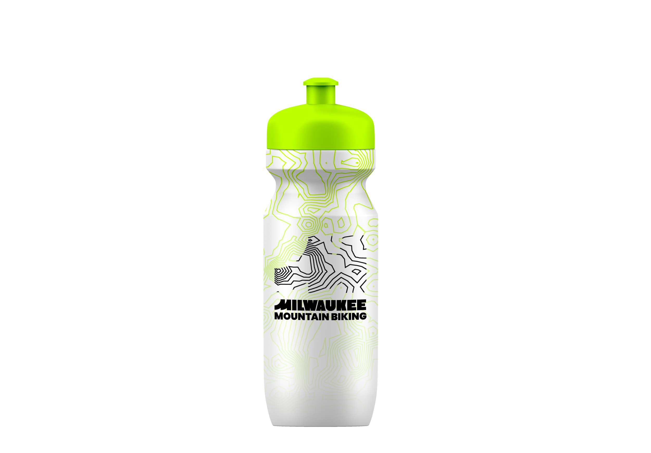
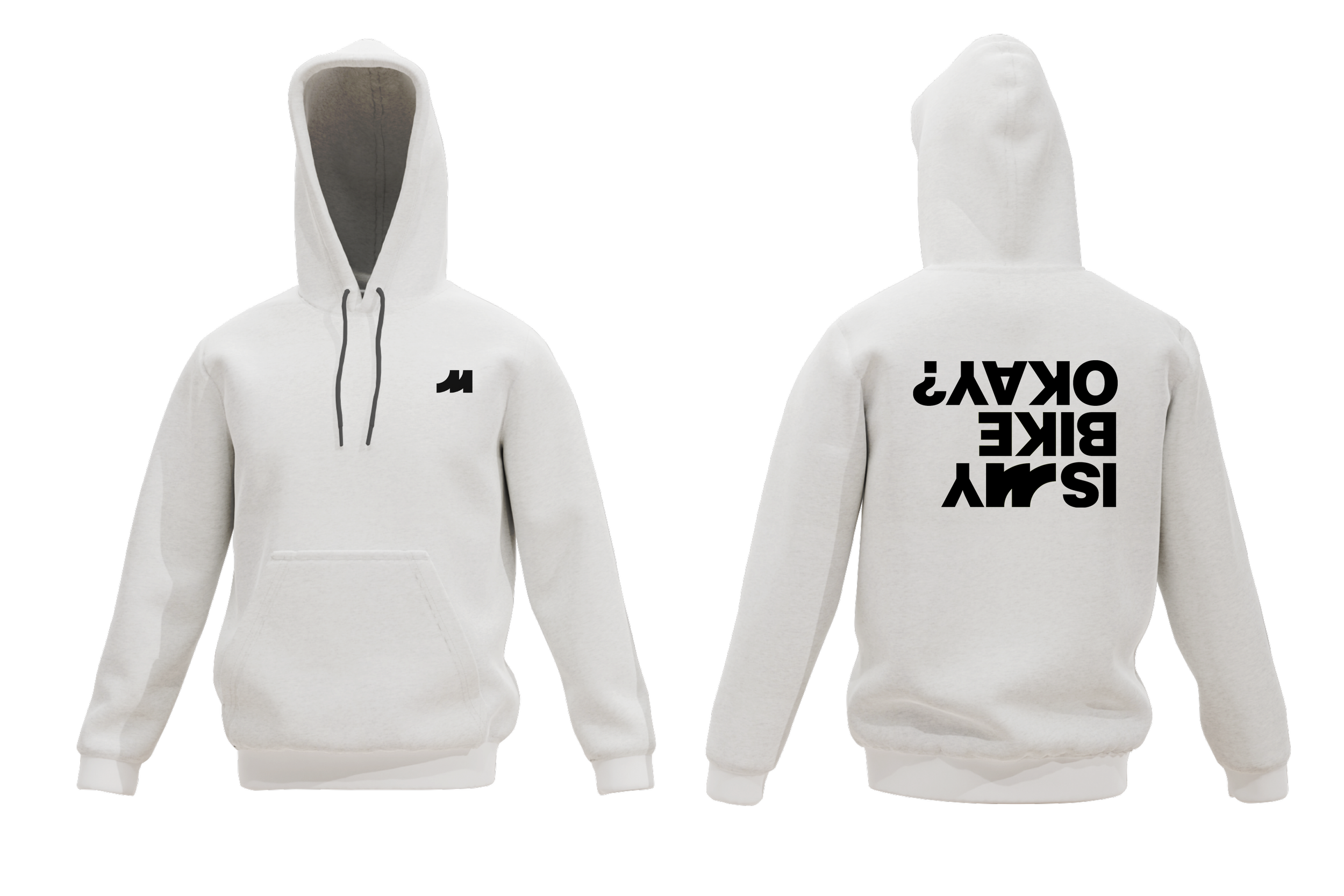
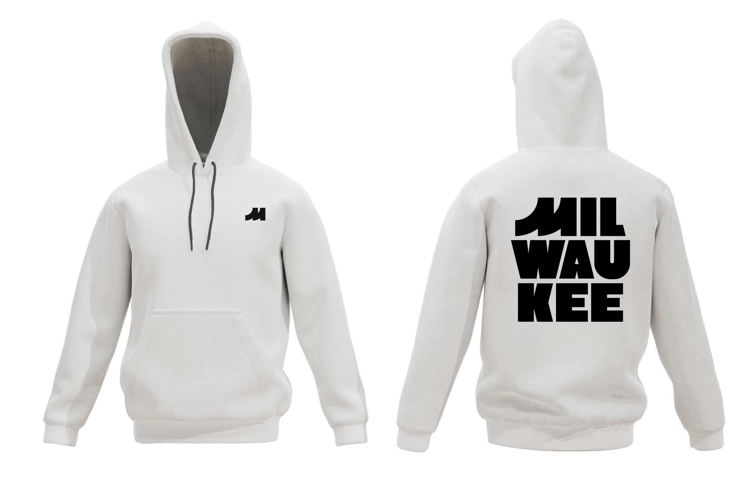
Jersey Kit, Jackets, Hoodies, Water Bottles, Socks, Shirts
Year
Spring 2026
*As a designer committed to uniting communities through sports design, I’m inspired by the athletes who refuse to let their circumstances define them. For these student-athletes, the trail becomes more than a race. It becomes a space to break away from expectations, prove themselves on their own terms, and discover who they are beyond where they come from. Every mile is an opportunity to build confidence, purpose, and a legacy entirely their own.